Your store navigation is the single most important UX element on your site. If customers cannot find what they are looking for within three seconds of landing, they leave. For stores with more than a handful of collections, a standard dropdown menu is not enough.
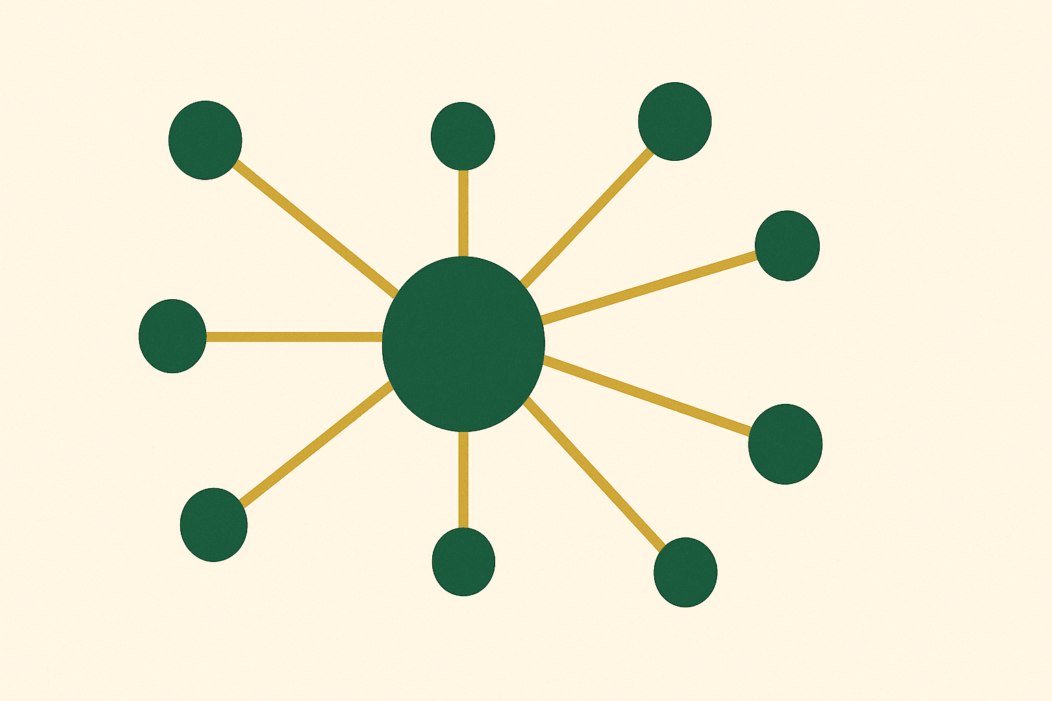
A mega menu solves this by displaying your entire category structure in a wide, multi-column panel that appears on hover or click. It lets customers see all their options at once, reducing the number of clicks to reach any product category from the homepage to one.
This guide walks through building a mega menu on Shopify — from planning the structure to writing the code to optimising for mobile and performance. Whether you use a theme that supports mega menus natively or need to build one from scratch, we cover both approaches.
Why your Shopify store needs a mega menu
Standard dropdown menus work for stores with 5-10 collections. But once you have 20, 50, or 100+ collections across multiple categories, a standard dropdown becomes a long, scrolling list that is difficult to navigate.
A mega menu improves the shopping experience in several measurable ways:
- Reduced bounce rate. Customers can see all categories immediately, reducing the chance they cannot find what they want and leave.
- Faster time to product. Fewer clicks from homepage to product page means less friction and more conversions.
- Visual merchandising. Mega menus can include images, promotional banners, and featured products — turning navigation into a merchandising opportunity.
- Better SEO. Internal links in the navigation distribute link equity to your most important collection pages, helping them rank in search.
- Reduced reliance on search. Not every customer uses site search. A well-structured mega menu ensures browse-first shoppers can navigate efficiently.
We build mega menus on virtually every Shopify store we develop, and the impact on navigation engagement is consistently positive.
Planning your mega menu structure
Before touching any code or theme settings, plan your mega menu on paper. The most common mistake is trying to put everything in the mega menu without thinking about hierarchy.
Define your top-level categories
Your mega menu should have 4-8 top-level items. Each top-level item triggers a mega menu panel when hovered or clicked. Common top-level items include:
- Product categories (Women, Men, Kids, Home)
- Use-case groups (Shop by Room, Shop by Sport, Shop by Skin Type)
- Collections (New In, Bestsellers, Sale)
- Informational pages (About, Blog, Contact)
Plan sub-categories per column
Under each top-level item, organise sub-categories into columns. Each column should have a heading and 5-10 links beneath it. A fashion store might structure "Women" as:
| Column 1: Clothing | Column 2: Accessories | Column 3: By Occasion | Column 4: Featured |
|---|---|---|---|
| Dresses | Bags | Workwear | [Promo image] |
| Tops | Jewellery | Weekend | New Collection |
| Trousers | Scarves | Evening | Spring Edit |
| Knitwear | Belts | Holiday | |
| Jackets | Hats |
The last column is often reserved for a promotional image or featured collection. This turns your navigation into a visual merchandising tool.
Step 1: Set up your Shopify navigation
Shopify's mega menu structure starts with the navigation settings in your admin. The menu hierarchy defines what appears in your mega menu.
- Go to Online Store > Navigation in your Shopify admin
- Select your Main menu (or create a new one)
- Add your top-level menu items (these become your mega menu triggers)
- Under each top-level item, add nested menu items using the drag handle to create child items
- For column groupings, create a second level of nesting — the first child level becomes column headings, and the second child level becomes the links within each column
Here is how the Shopify navigation structure maps to a mega menu layout:
Main Menu
├── Women                    ← Top-level (triggers mega panel)
│   ├── Clothing             ← Column heading
│   │   ├── Dresses          ← Column link
│   │   ├── Tops             ← Column link
│   │   └── Trousers         ← Column link
│   ├── Accessories          ← Column heading
│   │   ├── Bags             ← Column link
│   │   └── Jewellery        ← Column link
│   └── By Occasion          ← Column heading
│       ├── Workwear         ← Column link
│       └── Evening          ← Column link
├── Men                      ← Top-level
│   └── ...
└── New In                   ← Top-level
Getting this structure right in the navigation settings is essential. The menu structure is the data source your mega menu will render.
Step 2: Enable mega menu in your theme
Many modern Shopify themes include mega menu support. If your theme already supports it, enabling it is straightforward:
- Go to Online Store > Themes > Customise
- Click on the Header section
- Look for a "Menu type" or "Navigation style" setting
- Select Mega menu from the dropdown
- Configure which top-level items should trigger a mega menu panel (some themes let you choose per-item)
- Adjust column count, image settings, and layout options
- Save
Themes like Dawn, Prestige, Impulse, and Symmetry all support mega menus in varying capacities. The level of customisation varies — some let you add images per column, others are text-only.
If your theme does not support mega menus, or the built-in options are too limited, you will need to build one from scratch. Read on.
Step 3: Build a custom mega menu with Liquid
Building a mega menu from scratch gives you complete control over the design and functionality. Here is the approach we use on custom builds.
The Liquid template
Create a new snippet file called mega-menu.liquid in your theme's snippets folder. This snippet renders the mega menu panel for each top-level menu item:
<nav class="mega-nav" aria-label="Main navigation">
  <ul class="mega-nav-list">
    {%- for link in linklists.main-menu.links -%}
      <li class="mega-nav-item{% if link.links.size > 0 %} has-mega{% endif %}">
        <a href="{{ link.url }}" class="mega-nav-link"
           {% if link.links.size > 0 %}
             aria-haspopup="true" aria-expanded="false"
           {% endif %}>
          {{ link.title }}
        </a>

        {%- if link.links.size > 0 -%}
          <div class="mega-panel" role="menu">
            <div class="mega-panel-inner">
              {%- for child in link.links -%}
                <div class="mega-column">
                  <h3 class="mega-column-title">
                    <a href="{{ child.url }}">{{ child.title }}</a>
                  </h3>
                  {%- if child.links.size > 0 -%}
                    <ul class="mega-column-links">
                      {%- for grandchild in child.links -%}
                        <li><a href="{{ grandchild.url }}" role="menuitem">{{ grandchild.title }}</a></li>
                      {%- endfor -%}
                    </ul>
                  {%- endif -%}
                </div>
              {%- endfor -%}
            </div>
          </div>
        {%- endif -%}
      </li>
    {%- endfor -%}
  </ul>
</nav>
The CSS
The CSS controls the mega menu layout, positioning, and reveal animation:
.mega-nav-list {
  display: flex;
  gap: 2rem;
  list-style: none;
  margin: 0;
  padding: 0;
}

.mega-nav-item { position: relative; }

.mega-panel {
  position: absolute;
  left: 0;
  top: 100%;
  width: 100vw;
  background: #fff;
  box-shadow: 0 8px 32px rgba(0,0,0,.08);
  opacity: 0;
  visibility: hidden;
  transform: translateY(-8px);
  transition: opacity .2s, transform .2s, visibility .2s;
  z-index: 100;
}

.mega-nav-item:hover .mega-panel,
.mega-nav-item:focus-within .mega-panel {
  opacity: 1;
  visibility: visible;
  transform: translateY(0);
}

.mega-panel-inner {
  display: grid;
  grid-template-columns: repeat(auto-fit, minmax(180px, 1fr));
  gap: 2rem;
  max-width: 1200px;
  margin: 0 auto;
  padding: 2rem;
}

.mega-column-title {
  font-size: 0.875rem;
  font-weight: 600;
  text-transform: uppercase;
  letter-spacing: 0.05em;
  margin-bottom: 0.75rem;
}

.mega-column-links {
  list-style: none;
  padding: 0;
  margin: 0;
}

.mega-column-links li { margin-bottom: 0.5rem; }
.mega-column-links a { color: #555; text-decoration: none; }
.mega-column-links a:hover { color: #2D5A27; }
The JavaScript
Add keyboard navigation and accessibility support:
document.querySelectorAll('.mega-nav-item.has-mega').forEach(function(item) {
  var link = item.querySelector('.mega-nav-link');

  // Toggle on click for touch devices
  link.addEventListener('click', function(e) {
    if (window.innerWidth > 768 && item.querySelector('.mega-panel')) {
      var isOpen = link.getAttribute('aria-expanded') === 'true';
      // Close all
      document.querySelectorAll('.mega-nav-link[aria-expanded="true"]')
        .forEach(function(l) { l.setAttribute('aria-expanded', 'false'); });
      // Toggle current
      if (!isOpen) {
        e.preventDefault();
        link.setAttribute('aria-expanded', 'true');
      }
    }
  });

  // Close on Escape
  item.addEventListener('keydown', function(e) {
    if (e.key === 'Escape') {
      link.setAttribute('aria-expanded', 'false');
      link.focus();
    }
  });
});
Step 4: Add images and promotional content
A text-only mega menu is functional but misses a merchandising opportunity. Adding images turns your navigation into a visual experience.
Using metafields for mega menu images
The cleanest approach is using collection metafields to attach images to your mega menu items. Create a file reference metafield on collections called mega_menu_image, then reference it in your Liquid:
{%- assign collection = child.object -%}
{%- if collection.metafields.custom.mega_menu_image.value != blank -%}
  <img src="{{ collection.metafields.custom.mega_menu_image.value | image_url: width: 400 }}"
       alt="{{ child.title }}"
       loading="lazy"
       width="400" height="300">
{%- endif -%}
This approach keeps your images manageable. Each collection owner can update the mega menu image independently, and you are not hard-coding image URLs into your theme.
For more on metafields, read our custom theme development guide.
Adding a promotional banner
Reserve the last column of your mega menu for a promotional banner. This could be a seasonal campaign, a new collection launch, or a special offer. Use a theme section setting or a shop-level metafield to make it editable from the theme customiser.
Step 5: Optimise for mobile
The desktop mega menu does not work on mobile. You need a completely different navigation pattern for small screens.
Mobile accordion navigation
The standard approach is converting the mega menu into a full-screen accordion drawer on mobile:
- Top-level items appear as a vertical list
- Tapping a top-level item with children expands an accordion panel showing the sub-categories
- Each sub-category can expand further to show its links
- A "back" button or swipe gesture returns to the previous level
Use a CSS media query to switch between desktop and mobile layouts:
@media (max-width: 768px) {
  .mega-nav-list { flex-direction: column; }
  .mega-panel {
    position: static;
    width: 100%;
    box-shadow: none;
    display: none;
  }
  .mega-nav-item.is-open .mega-panel {
    display: block;
    opacity: 1;
    visibility: visible;
    transform: none;
  }
  .mega-panel-inner {
    grid-template-columns: 1fr;
    padding: 1rem;
  }
}Step 6: Performance and accessibility
Performance considerations
- Lazy-load images. Mega menu images should use
loading="lazy"since they are not visible on initial page load. - Minimise DOM size. Render only the mega menu panels that are actually used. If a top-level item has no children, do not render an empty panel.
- Avoid third-party apps. Mega menu apps add JavaScript that loads on every page. A native Liquid solution has zero overhead beyond the HTML and CSS.
- Compress images. Mega menu images should be small (400px wide maximum) and compressed. Use Shopify's image CDN with the
image_urlfilter.
Accessibility requirements
- Use
aria-haspopup="true"andaria-expandedon trigger elements - Ensure the mega menu is keyboard navigable (Tab, Arrow keys, Escape)
- Use
role="menu"androle="menuitem"appropriately - Ensure sufficient colour contrast for all text
- Test with screen readers (NVDA, VoiceOver)
Our approach to performance and accessibility is covered in depth in our technical SEO guide.
Common mega menu mistakes
1. Too many items
A mega menu that lists every sub-sub-category becomes overwhelming. Limit each panel to 4-6 columns with 5-10 items each. Use "View all" links for categories with many sub-items.
2. No visual hierarchy
Column headings should be visually distinct from column links. Use different font weights, sizes, or colours so customers can scan quickly.
3. Broken on mobile
Testing only on desktop is the most common mistake. Always test your mega menu on real mobile devices, not just the browser's responsive mode.
4. No close mechanism
Users need a way to close the mega menu without clicking a link. Ensure clicking outside the panel or pressing Escape closes it.
5. Using an app when you do not need one
Mega menu apps add JavaScript and CSS to every page load. For most stores, a native Liquid mega menu is lighter, faster, and more customisable. Only use an app if your theme truly cannot support a custom implementation.
A mega menu is not just a navigation upgrade — it is a conversion optimisation tool. By surfacing your full category structure, adding visual merchandising, and making the path to purchase shorter, you reduce friction and keep customers engaged.
The key is planning your structure before building, keeping performance tight, and ensuring the mobile experience is just as polished as desktop.
Need help building a mega menu for your store, or looking for a complete Shopify development and web design solution? Get in touch — we build navigation systems that work for stores of every size.