
Popups have a bad reputation, and most of it is deserved. Intrusive, poorly timed, and irrelevant popups annoy visitors and damage the user experience. But done well, popups remain one of the highest-converting tools for email capture, cart recovery, and promotional messaging on Shopify stores.
This guide shows you how to create popups that respect your visitors whilst driving measurable results. We cover the technical setup, targeting strategies, design principles, and testing methodology that separate effective popups from the ones customers hate.
Before adding popups to your store, consider how they fit into your overall conversion rate optimisation strategy. Popups are one tool among many, and they work best when part of a coordinated approach to improving the customer experience.
Why popups still work in 2026
Despite widespread popup fatigue, the data consistently shows that well-designed popups outperform passive forms for email capture. The average popup conversion rate sits around 3-5%, with top-performing popups reaching 10% or higher. By comparison, inline signup forms typically convert at less than 1%.
The attention problem
Online shoppers are distracted. They browse with dozens of tabs open, get interrupted by notifications, and often leave a site simply because they forgot they were there. A popup interrupts this pattern and demands a decision — subscribe, claim the offer, or dismiss. This forced interaction is what makes popups effective when done well.
Email list building
Your email list is one of your most valuable marketing assets. Unlike social media followers or search rankings, you own your email list. A popup offering a discount in exchange for an email address is one of the fastest ways to build that list. This feeds directly into your Klaviyo email marketing efforts and gives you a direct channel to potential customers.
Revenue recovery
Exit-intent popups that trigger when a visitor is about to leave can recover a meaningful percentage of otherwise lost sales. Offering free shipping, a limited-time discount, or simply reminding the visitor of items in their cart can bring them back from the brink. For more on this, see our guide to reducing cart abandonment on Shopify.
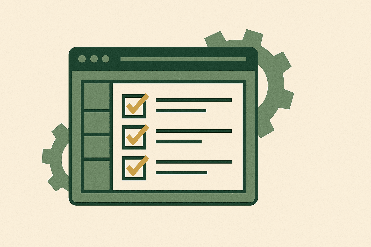
Types of Shopify popups
Not all popups are created equal. Understanding the different types helps you choose the right one for each objective.
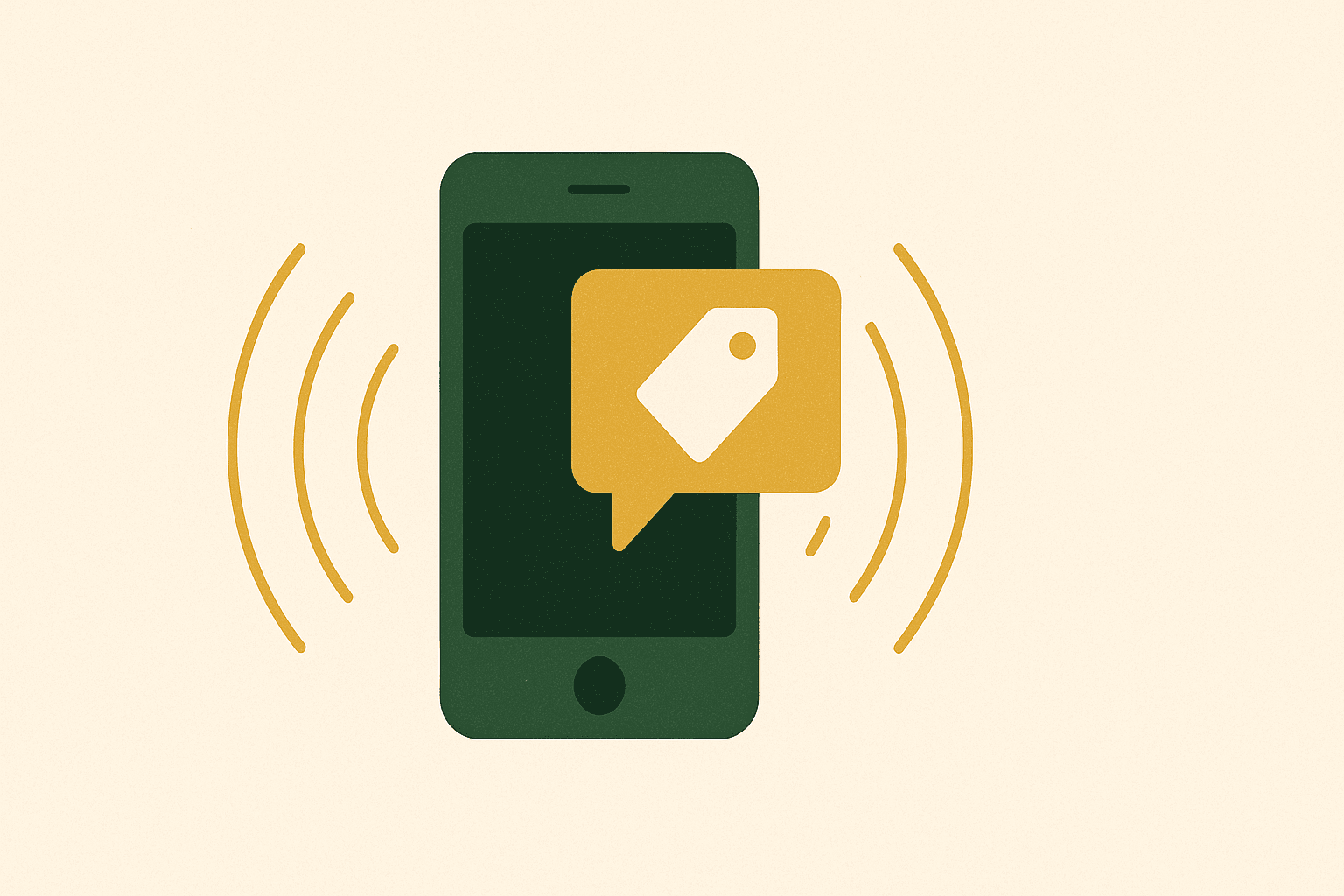
Email capture popups
The most common type. Offer a discount, free shipping, or exclusive content in exchange for an email address. These typically appear after a short delay or on scroll, targeting new visitors who have not yet subscribed. The key metric is conversion rate — the percentage of visitors who see the popup and submit their email.
Exit-intent popups
Triggered when the visitor's cursor moves toward the browser close button (on desktop) or after a period of inactivity (on mobile). These are your last chance to convert a leaving visitor. Common offers include a discount code, free shipping, or a reminder of cart contents.
Cart abandonment popups
Specifically targeting visitors who have items in their cart and are about to leave. These can show the cart contents, highlight the total value, and offer an incentive to complete the purchase. They are particularly effective for increasing average order value.
Announcement popups
Used for site-wide communications: sales events, new product launches, shipping delays, or policy changes. These are informational rather than transactional and should be easy to dismiss.
Gamified popups
Spin-to-win wheels, scratch cards, and quiz-based popups add an element of fun to the email capture process. They tend to have higher engagement rates but can feel gimmicky for premium brands. Use them if they align with your brand personality.
Shopify native popup options
Shopify's Online Store 2.0 themes include basic popup functionality through the theme customiser. You can typically find this under the theme editor's footer or overlay sections.
Theme-based popups
Most modern Shopify themes include a newsletter popup section. This usually offers basic customisation: heading text, body text, an email input field, and a submit button. The trigger is typically page load with a configurable delay. While functional, these native popups are limited in targeting, design, and analytics capabilities.
When native popups are sufficient
If you just need a simple email capture popup for new visitors with a basic discount offer, the theme's built-in popup may be enough. It avoids adding another app to your stack, which is good for page speed and Core Web Vitals.
Best popup apps for Shopify
For more advanced functionality, you will need a dedicated popup app. Here are the key features to look for when choosing one.
Essential features
- Multiple trigger types. Time delay, scroll percentage, exit intent, click, and page-specific triggers.
- Audience targeting. Show different popups to new vs returning visitors, by geographic location, by referring source, or by cart value.
- A/B testing. Test different offers, designs, and triggers to optimise conversion rates over time.
- Email integration. Direct integration with Klaviyo or your email platform of choice for seamless subscriber management.
- Mobile responsiveness. Proper mobile popups that comply with Google's interstitial guidelines and provide good UX on smaller screens.
- Analytics. Detailed reporting on impressions, conversions, and revenue attributed to each popup campaign.
Before adding a popup app, audit your current app stack to avoid conflicts and performance degradation.
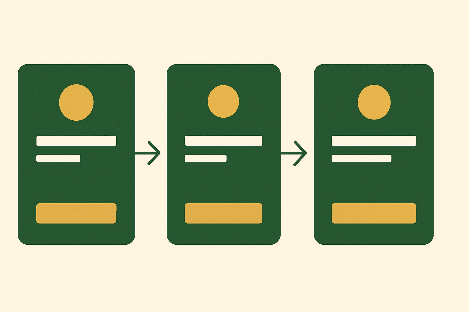
Setting up your first popup step by step
Here is the general process for creating a converting popup on Shopify using a third-party app.
Step 1: Define your objective
Before touching the popup builder, decide what you want the popup to achieve. Email capture? Cart recovery? Product announcement? Your objective determines the offer, design, timing, and targeting rules you need to configure.
Step 2: Craft your offer
The offer is the single biggest factor in popup performance. A 10% discount code is the most common offer, but consider what is most compelling to your audience. Free shipping might convert better than a percentage discount. A free sample or gift with purchase can feel more exclusive. Match the offer to your pricing strategy.
Step 3: Design the popup
Keep the design clean and on-brand. Use your brand colours, fonts, and imagery. The headline should communicate the offer immediately. The form should be minimal — email address only for initial capture. You can collect more data later through your email flows.
Step 4: Set triggers and timing
For email capture, a 5-10 second delay or 30-50% scroll trigger works well. This gives visitors time to engage with your site before being interrupted. For exit-intent, set the popup to trigger on cursor movement toward the close button. Avoid triggering immediately on arrival — this feels aggressive and earns dismissals.
Step 5: Configure targeting
Show the popup only to visitors who have not already subscribed. Exclude logged-in customers who are already on your list. Consider showing different popups on different pages — a product-specific popup on product pages and a general welcome popup on the homepage.
Step 6: Connect your email platform
Ensure new subscribers are pushed directly to your Klaviyo list with appropriate tags. Set up a welcome flow that delivers the promised discount code and begins nurturing the new subscriber. See our guide to essential Klaviyo flows for the complete welcome sequence structure.
Step 7: Test and launch
Preview the popup on desktop and mobile. Check that the discount code is delivered correctly via email. Verify the email integration works end to end. Then launch to a small percentage of traffic before rolling out to all visitors.
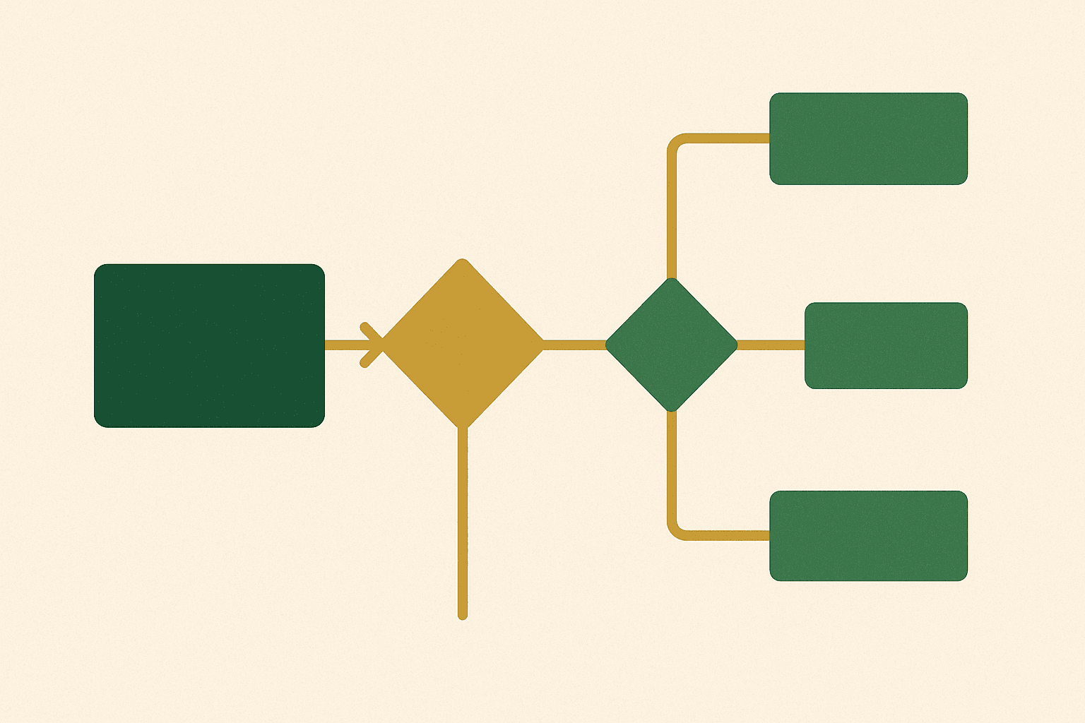
Targeting and trigger rules
Effective targeting is what separates a helpful popup from an annoying one. The goal is to show the right message to the right person at the right time.
New vs returning visitors
New visitors should see your welcome offer — typically a first-purchase discount in exchange for their email. Returning visitors who have already subscribed should see different content, or no popup at all. Showing the same welcome popup to someone who has already subscribed damages the experience and wastes an opportunity.
Page-specific targeting
A popup on a product page should be different from one on a blog post. On product pages, focus on purchase incentives. On blog posts, focus on content subscription. On collection pages, consider highlighting specific promotions for that category.
Cart value targeting
Show free shipping popups to visitors whose cart value is close to your free shipping threshold. If free shipping kicks in at £50 and the visitor's cart is at £40, a popup saying "Add £10 more for free shipping" can be highly effective at increasing basket size.
Geographic targeting
Show different offers to visitors from different countries. This is especially useful if you have market-specific promotions or if you sell internationally with different currency and pricing per region.

Exit-intent popups that recover sales
Exit-intent popups are your last line of defence against bounce. They trigger at the moment a visitor is about to leave, giving you one final chance to convert them.
What works for exit-intent
- Urgency-driven offers. "Wait — here is 15% off, but only for the next 30 minutes." The time constraint creates genuine urgency.
- Cart reminders. "You left items in your cart worth £87. Complete your order now." This works because the visitor has already shown purchase intent.
- Free shipping. "Do not leave — we will cover the shipping on your order today." Shipping cost is the most common reason for cart abandonment.
- Social proof. "200 people bought this today. Here is 10% off if you complete your order now." Combines urgency with social validation.
Exit-intent on mobile
True exit-intent (cursor tracking) does not work on mobile devices. Instead, mobile exit-intent proxies include the visitor pressing the back button, a period of inactivity, or scrolling back to the top of the page. Some apps handle this well; others do not. Test mobile exit-intent thoroughly before relying on it.
Popup design best practices
The design of your popup directly impacts its conversion rate. Follow these principles for maximum effectiveness.
Keep it simple
One clear offer. One clear action. Minimal text. Visitors decide in seconds whether to engage or dismiss, so communicate your value proposition instantly. Avoid walls of text, multiple offers, or complex multi-field forms.
Use strong imagery
A popup with a relevant product image or lifestyle photo converts better than text-only designs. The image should support the offer — if you are promoting a collection, show the collection. If offering a discount on first purchase, show your bestselling product.
Make the close button obvious
Nothing frustrates visitors more than a popup they cannot close. Make the close button clearly visible and easy to tap on mobile. A dark "X" in the top corner is the convention — do not deviate from it. Hiding the close button or making it tiny is a dark pattern that damages trust and increases bounce rate.
Match your brand
Your popup should feel like part of your site, not a foreign element. Use your brand colours, fonts, and tone of voice. A popup that looks different from your website design feels untrustworthy and lowers conversion rates.
A/B testing your popups
Never assume your first popup design is optimal. A/B testing lets you systematically improve performance over time and make decisions based on data rather than instinct.
What to test
- Offer type. 10% off vs free shipping vs free gift. Different audiences respond to different incentives.
- Trigger timing. 5-second delay vs 10-second delay vs scroll-based trigger. Earlier popups get more impressions but may annoy visitors.
- Headline copy. Test different value propositions. "Get 10% Off" vs "Join 50,000 Happy Customers" vs "Unlock Your Welcome Discount".
- Design elements. With image vs without. Single-step vs two-step (teaser then full popup). Colour variations.
- Form fields. Email only vs email plus name. Fewer fields mean higher conversion but less data for personalisation.
For more on testing methodology, see our guide to A/B testing on Shopify.
Testing methodology
Run each test for at least two weeks or until you have statistical significance (typically 1,000+ views per variant). Change only one variable at a time so you can attribute any performance difference to that specific change. Document every test and its results so you build institutional knowledge about what works for your audience.
Mobile popup considerations
Mobile popups require special attention because of smaller screens and Google's mobile interstitial guidelines.
Google's interstitial penalty
Google penalises mobile pages that show intrusive interstitials covering the main content. Popups that cover the entire screen on mobile can trigger this penalty, negatively impacting your SEO rankings. To stay compliant, ensure your mobile popup covers less than 30% of the screen, or use a banner or slide-in format instead of a full overlay.
Touch-friendly design
Buttons and close elements must be large enough to tap easily with a thumb. Form fields should use the appropriate input type (email keyboard for email fields). The popup should be scrollable if content does not fit the viewport. Test on actual mobile devices, not just desktop browser simulations.
Performance impact
Popup apps add JavaScript to your site, which can impact loading speed. On mobile, where connections may be slower, this is particularly important. Monitor your Core Web Vitals after adding popup functionality to ensure your page speed remains healthy.
GDPR and privacy compliance
Email capture popups must comply with privacy regulations, particularly GDPR in the UK and EU, and similar legislation worldwide.
Consent requirements
Under GDPR, you need explicit consent to send marketing emails. Your popup form should include clear language about what the subscriber is signing up for. A checkbox for marketing consent (unchecked by default) is recommended. Simply adding an email to your list without clear consent is a violation that can result in significant fines.
Privacy policy link
Include a link to your privacy policy near the popup form. This does not need to be prominent, but it must be present and accessible. Most popup apps allow you to add a small text link below the submit button.
Double opt-in
Consider using double opt-in, where subscribers receive a confirmation email and must click a link to verify their subscription. This improves list quality and provides stronger consent evidence, though it reduces the total number of subscribers who complete the process. Klaviyo supports both single and double opt-in configurations.
Common popup mistakes to avoid
These are the popup mistakes we encounter most often on Shopify stores we audit and improve.
1. Showing popups immediately on page load
Let visitors engage with your site before interrupting them. A popup that appears before the page has fully loaded feels aggressive and often gets dismissed without being read. Wait at least 5 seconds or until the visitor has scrolled to show initial interest.
2. Showing the same popup to returning visitors
If a visitor dismissed your popup or already subscribed, do not show it again on the next visit. Use cookies to track popup interactions and suppress for a reasonable period — 30 days for dismissed, permanently for subscribed.
3. Making the discount hard to use
If your popup promises a discount code, make it easy to use. Send the code via email immediately. Also show it on the thank-you message within the popup itself. Auto-apply it at checkout if possible. Any friction between offer and redemption kills conversion.
4. Too many popups on one visit
One popup per visit is the maximum. If a visitor closes your welcome popup, do not then hit them with an exit-intent popup, then a newsletter popup. Coordinate your popups so only the most relevant one shows per session.
5. Ignoring mobile experience
A popup designed for desktop often looks terrible on mobile. Always design and test mobile separately. Consider using a slide-in banner instead of a full overlay on mobile devices.
6. Not testing performance impact
Popup apps add JavaScript that can slow your site. Test your page speed before and after adding popup functionality. If the impact is significant, consider lighter alternatives or lazy-loading the popup script so it does not block initial page rendering.
The best popups feel like a helpful suggestion rather than an interruption. If your popup would annoy you as a shopper, it will annoy your customers. Respect their time, make a genuine offer, and make it easy to say no.
Andrew Simpson, Founder
Creating effective popups on Shopify is about balancing conversion goals with user experience. Start with a single, well-targeted email capture popup, measure its performance, and iterate from there. Add exit-intent and cart-specific popups once you have the basics working.
If you need help designing high-converting popups or integrating them with your Shopify store and email marketing, get in touch. We build conversion-optimised experiences that grow your list without damaging your brand.