Most ecommerce brands obsess over traffic. They spend thousands on paid ads, pour effort into SEO, and agonise over social media content. Then they watch 60-70% of shoppers who reach checkout walk away without completing a purchase.
The checkout is where revenue lives or dies. A store generating 50,000 sessions per month with a 2.5% conversion rate and £65 average order value produces £81,250 in monthly revenue. Improve the checkout completion rate by just 10% (a realistic target for most unoptimised stores), and you add over £8,000 per month without spending a penny more on acquisition.
After twenty years building and scaling ecommerce brands, we have learned that checkout optimisation consistently delivers the highest return on investment of any CRO activity. It is also the most neglected. This guide covers everything we know about getting it right on Shopify.
Why checkout optimisation matters more than you think
The maths is straightforward but often ignored. Consider two stores with identical traffic, product range, and pricing. Store A has a checkout completion rate of 45%. Store B has optimised theirs to 62%. With 1,000 checkout initiations per month at £70 AOV, the difference is £11,900 in monthly revenue. That is £142,800 annually from the same traffic.
The reason checkout optimisation delivers such outsized returns is that you are working with the highest-intent audience on your entire site. These people have already browsed, evaluated, and decided to buy. They have added products to cart and clicked through to checkout. They are as close to converting as a visitor can get. Every friction point you remove at this stage has a disproportionate impact on revenue.
Yet most stores treat checkout as a technical afterthought. They spend weeks on homepage design and product photography but leave the checkout entirely at its default settings. That is leaving money on the table.

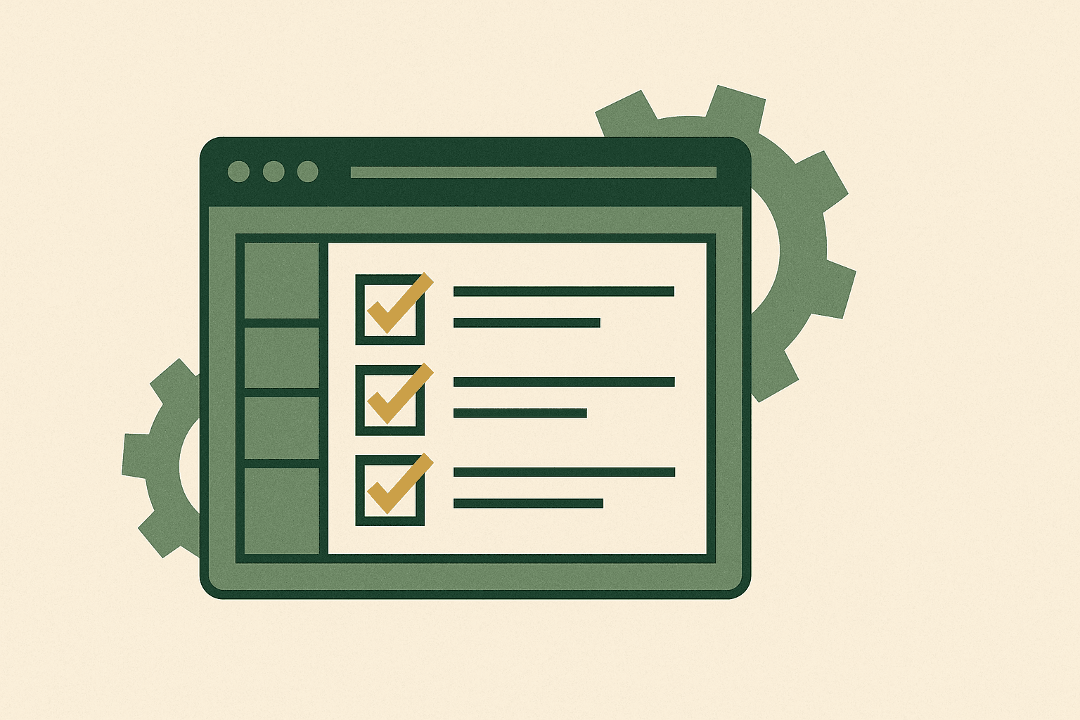
Anatomy of a high-converting Shopify checkout
A well-optimised Shopify checkout shares several characteristics regardless of the industry, price point, or product type. These are not opinions — they are patterns we have observed across hundreds of stores.
Speed and perceived performance
Checkout page load time directly correlates with completion rate. Every 100ms of additional load time reduces conversion by approximately 1.1%, according to research from major ecommerce platforms. On Shopify, checkout speed is largely handled by Shopify's infrastructure, but the apps you install, the scripts you inject, and the checkout customisations you add all affect perceived performance.
The most impactful actions are removing unnecessary third-party scripts from the checkout, ensuring any checkout UI extensions load asynchronously, and avoiding heavy image assets within the checkout flow itself.
Visual continuity with the store
When a customer moves from your product page to checkout and the visual language changes completely — different fonts, different colours, different layout — it creates a moment of uncertainty. That uncertainty costs conversions. Shopify allows you to customise checkout branding (logo, colours, fonts, and background) under Settings > Checkout. Every store should use this at minimum.
Progress clarity
Customers need to know where they are in the process and how much more is required. Shopify's one-page checkout has largely solved this by placing everything on a single view, but if you are still on the multi-step checkout (or using Shopify Plus with custom steps), clear progress indicators are essential.
The best checkout is the one the customer barely notices. When every element is in the right place, with the right information, at the right moment, people complete their purchase without friction — and without even thinking about it.
Order summary visibility
On desktop, the order summary should be persistently visible. On mobile, it should be accessible with a single tap. The customer should never have to leave checkout to confirm what they are buying, how much it costs, or whether their discount code was applied. Any ambiguity here creates anxiety, and anxiety kills conversions.
One-page checkout: what changed and why it works
In August 2023, Shopify rolled out one-page checkout as the default for all stores. This was the most significant checkout change in the platform's history, and the data since then has been unambiguous: it works.
The old three-step checkout (Information > Shipping > Payment) required three page loads, three moments of potential abandonment, and three opportunities for the customer to reconsider. The one-page checkout collapses this into a single view where the customer can see and complete everything at once.
The key benefits we have seen across client stores:
- Reduced perceived effort. Seeing all fields at once feels faster than clicking through multiple steps, even when the total number of fields is identical.
- Fewer page loads. Each page load is an exit opportunity. One page means one opportunity instead of three.
- Better mobile experience. Scrolling through a single form is more natural on mobile than navigating between separate pages.
- Faster completion. Shopify reports that one-page checkout completes up to 4 seconds faster on average.
If your store has not yet migrated to one-page checkout, this is the single highest-impact change you can make. It requires no development work — it is a setting in your Shopify admin under Settings > Checkout.
Payment methods that move the needle
Offering the right payment methods is not about having the most options. It is about having the right ones for your audience. Here is what the data says for UK ecommerce stores:
Essential payment methods
| Payment method | Why it matters | Impact on conversion |
|---|---|---|
| Credit/debit cards | Still the default for most UK shoppers | Baseline — must have |
| Shop Pay | Auto-fills saved details for returning Shopify network users | Up to 50% faster checkout |
| PayPal | Trusted brand, buyer protection perception | 10-15% of UK online transactions |
| Apple Pay / Google Pay | One-tap mobile checkout | Significant on mobile |
| Klarna / Clearpay | Buy-now-pay-later for considered purchases | Higher AOV, higher conversion on £50+ items |
Shop Pay deserves particular attention. Because it stores customer details across the entire Shopify network (over 100 million buyers), returning customers can complete checkout with a single click. For stores with repeat purchase behaviour, this is transformative.
The buy-now-pay-later question divides opinion, but the data is clear for stores with an AOV above £50: offering Klarna or Clearpay typically increases conversion rate by 5-15% and average order value by 10-20%. For lower-AOV stores, the impact is less pronounced and may not justify the additional payment processing fees. This ties directly into how you reduce cart abandonment on Shopify — payment flexibility is one of the most effective levers.
Express checkout buttons
Express checkout buttons (Shop Pay, Apple Pay, Google Pay) should appear both on product pages and at the top of the checkout page. This gives customers the option to skip the form entirely if their details are already saved. On mobile, where form-filling is tedious, express checkout can increase conversion by 20% or more.
Trust signals and their measurable impact
Trust is the currency of checkout. A customer at checkout is about to hand over their payment details and personal information. Any doubt — about security, legitimacy, delivery, or returns — can derail the transaction.
Security indicators
Shopify handles SSL and PCI compliance automatically, but customers do not know that. Visual cues matter. The padlock icon, "Secure checkout" text, and payment card logos all reinforce that the transaction is safe. These seem obvious, but we regularly audit stores where the checkout has no visible security messaging.
Delivery and returns information
The checkout is the wrong place for customers to discover unexpected delivery costs or restrictive return policies. However, it is the right place to reinforce positive policies. If you offer free delivery, free returns, or next-day dispatch, display this prominently within the checkout.
Shopify Plus stores can add custom banners and information blocks directly within the checkout using checkout UI extensions. Standard Shopify stores can use the additional content fields in checkout settings to surface key information.
Social proof at checkout
This is an underused tactic. A small "Trusted by 50,000+ customers" or "4.8/5 from 2,000+ reviews" message within the checkout reinforces the buying decision at the critical moment. It does not need to be elaborate. A single line of text with genuine numbers is enough.
Effective checkout optimisation is part of a broader conversion rate optimisation practice. Trust signals are just one element of a system that compounds over time.
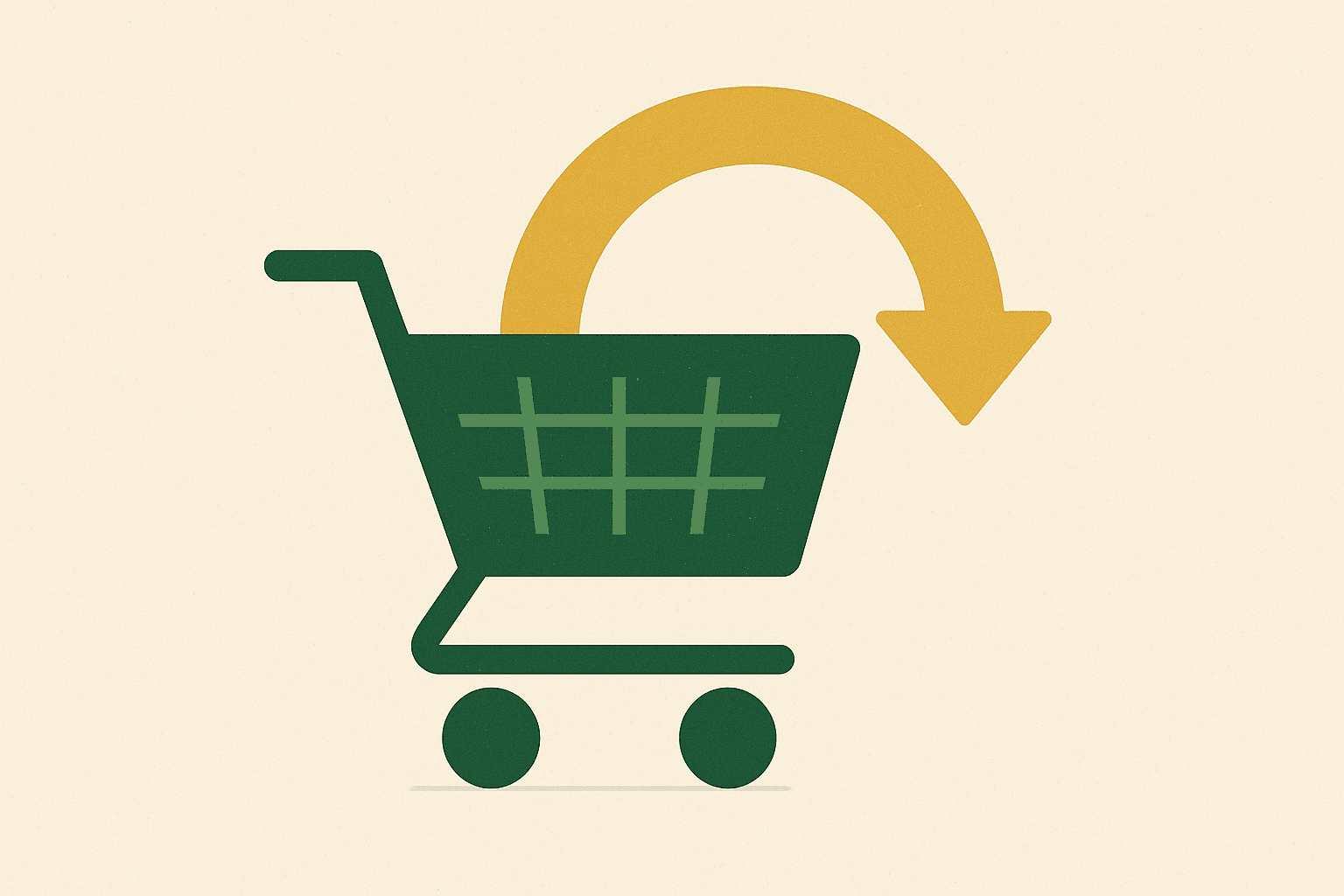
Mobile checkout: where most stores lose
Over 70% of UK ecommerce traffic now comes from mobile devices. Yet mobile checkout completion rates are consistently 15-25% lower than desktop. The gap is not because mobile users are less intent on buying — it is because mobile checkout experiences are typically worse.
The mobile checkout checklist
- Input types matter. Email fields should trigger the email keyboard. Phone fields should trigger the number pad. Postcode fields should trigger uppercase keyboards. Shopify handles most of this natively, but custom checkout extensions sometimes break it.
- Autofill must work. If the browser's autofill cannot populate your checkout fields, you are adding 30-60 seconds of manual typing on a small screen. Test this on both iOS Safari and Android Chrome.
- Tap targets need adequate size. Buttons and interactive elements should be at least 44x44 pixels. Smaller targets lead to mis-taps and frustration.
- The keyboard should not obscure the active field. When a customer taps a form field, the viewport should scroll so the field is visible above the keyboard. This is a common issue with custom checkout implementations.
- The order summary should collapse gracefully. On mobile, a full order summary takes up valuable screen space. It should be collapsible with a clear expand/collapse toggle.
Address autocomplete
Shopify includes address autocomplete powered by Google in most markets. For UK stores, this works well for most addresses. However, if your customer base includes rural areas or new-build estates, you may encounter accuracy issues. Consider supplementing with a dedicated UK address lookup service if you see high error rates in delivery data.
Address autocomplete reduces form completion time by an average of 20% and reduces address errors (which cause failed deliveries, customer support tickets, and returns) by up to 50%. The ROI case is straightforward.
Shopify Plus checkout extensibility
Shopify Plus unlocks a level of checkout customisation that standard plans cannot match. If you are on Shopify Plus (or considering it), here is what becomes possible and how to use it effectively.
Checkout UI extensions
Checkout UI extensions let you add custom content blocks to specific locations within the checkout. These are sandboxed React components that render natively within Shopify's checkout, maintaining performance and security. Practical uses include:
- Custom trust badges and security messaging
- Delivery date selectors
- Gift wrapping options
- Loyalty point displays
- Custom upsell blocks within the checkout
- Order-level notes or special instructions
Shopify Functions
Functions let you customise the logic of the checkout without modifying the UI. This includes custom discount logic (buy-two-get-one-free, tiered discounts, customer-specific pricing), custom shipping rate calculations, and payment method visibility rules (hiding certain payment options based on cart contents or customer tags).
For a deeper exploration of what Shopify Plus checkout offers, see our complete Shopify Plus checkout customisation guide.
The checkout editor
The checkout editor provides a visual, drag-and-drop interface for rearranging checkout elements and placing UI extensions. This means your marketing team can make certain changes (repositioning trust badges, changing copy, toggling features) without developer involvement. It is a significant operational improvement for stores that iterate frequently.
Post-purchase upsells and thank you page optimisation
The moment after payment is confirmed is one of the highest-intent moments in the customer journey. The customer has just demonstrated trust by completing a purchase. The friction of payment is behind them. This is the perfect time for a well-targeted upsell.
Post-purchase upsell mechanics
Shopify Plus allows post-purchase pages — screens that appear between payment confirmation and the thank you page. The customer sees a relevant offer and can accept it with a single click (no need to re-enter payment details). Acceptance rates for well-targeted post-purchase offers typically range from 5-15%.
The key to making post-purchase upsells work is relevance. If someone just bought a coffee grinder, offer them a bag of speciality beans. If they bought running shoes, offer performance socks. Generic "you might also like" suggestions perform poorly at this stage.
Thank you page optimisation
The default Shopify thank you page is functional but uninspiring. Consider adding:
- Referral programme prompts. Customers are at peak satisfaction immediately after purchasing. This is the ideal moment to ask for referrals.
- Social media follows. Offer a reason to follow (exclusive content, early access) rather than just displaying icons.
- Survey questions. "How did you hear about us?" is invaluable attribution data that costs nothing to collect.
- Expected delivery information. Reinforcing when the order will arrive reduces "where is my order" support tickets.
Smart post-purchase strategies connect directly to your wider AOV optimisation approach. The cart and the checkout are two sides of the same coin.
Measuring checkout performance
You cannot optimise what you do not measure. Here are the metrics that matter for checkout performance on Shopify:
Primary metrics
| Metric | How to calculate | Benchmark |
|---|---|---|
| Checkout completion rate | Orders / Checkout initiations | 45-65% |
| Checkout abandonment rate | 1 - Completion rate | 35-55% |
| Time to complete checkout | GA4 event timing | Under 3 minutes |
| Payment failure rate | Failed payments / Payment attempts | Under 3% |
| Express checkout adoption | Express orders / Total orders | 15-30% |
Setting up tracking
Shopify's native analytics provide checkout completion rate and abandoned checkout data. For deeper analysis, configure GA4 enhanced ecommerce tracking to capture each checkout step as a separate event. This allows you to build funnel reports showing exactly where customers drop off.
Pay particular attention to the difference between desktop and mobile completion rates, new versus returning customer completion rates, and completion rate by payment method. These segments often reveal specific, actionable problems.
Common checkout mistakes we see
After auditing hundreds of Shopify stores, these are the checkout mistakes we encounter most frequently:
1. Requiring account creation
Forcing customers to create an account before they can complete checkout is one of the most damaging things you can do to your conversion rate. Guest checkout should always be available. You can prompt account creation after the purchase is complete — the customer already has an account-like relationship with you at that point.
Shopify's "Shop" login offers a middle ground: customers with Shop accounts can log in instantly to auto-fill details, but account creation is never required.
2. Surprise costs at checkout
Unexpected shipping costs, taxes, or fees revealed at checkout are the number one cause of checkout abandonment. If you cannot offer free shipping, display shipping costs on product pages or in the cart before checkout begins. Transparency builds trust; surprises destroy it.
3. Too many form fields
Every additional field you add to checkout reduces completion rate. Review your checkout fields and remove anything that is not strictly necessary. Do you really need a company name field for a DTC brand? Does every order need a phone number? If the field is optional, consider whether it should exist at all.
4. Broken discount code experience
If your store uses discount codes, the discount field should be prominent and easy to use. We see stores where the discount field is hidden behind a toggle, requires a specific format, or fails silently when an expired code is entered. These micro-frustrations compound into abandonment.
5. Not testing across browsers and devices
A checkout that works perfectly in Chrome on a MacBook Pro may break on Samsung Internet on a mid-range Android phone. Test your checkout on the devices and browsers your customers actually use. Shopify analytics tells you which browsers and devices your traffic comes from — use that data to prioritise testing.
Putting it all together
Checkout optimisation is not a one-off project. It is an ongoing discipline that requires regular measurement, testing, and iteration. The stores that perform best at checkout treat it as a core commercial function, not a technical implementation detail.
Start with the fundamentals: one-page checkout, the right payment methods, clear trust signals, and a mobile-first approach. Then measure relentlessly and iterate on what the data tells you. If you are on Shopify Plus, use the extensibility tools to build a checkout experience that matches your brand and addresses your specific customer needs.
If you are seeing high checkout abandonment and want to understand where the opportunities are, our Shopify development team can run a full checkout audit. We will show you exactly where you are losing customers and what to do about it. Start a conversation — no pressure, just practical advice.